[Redacted] Design Challenge
January 29, 2020
This is a 2 day at-home design challenge I completed as part of the interview process for a company in the online retail industry. The challenge included 2 parts: 1) add or improve a feature to an existing online product of my choice — producing mockups, research, and a project plan, and 2) design an Instagram carousel ad to introduce a fictitious initiative for the brand Farfetch (that's not who I interviewed with) to best meet some provided KPIs.
Part 1: Product Design
Amazon.com, at the scale they operate, is in a unique position to take advantage of improvements to their shopping experience, so I’m going to take a crack at scoping out an enhancement to their product purchase UX that I believe would increase conversion rates.
On the Amazon mobile app experience, the typical listing detail page is typically upwards of 30,000 (!) pixels tall. I doubt many people are scrolling through the entire page, but to browse through the product details and continue to the reviews (which are usually around the middle of the page) can take a dozen or so swipes.
I’m going to safely assume that Amazon’s primary CTAs on this page are the Add to Cart and Buy Now buttons. On an almost 30,000 pixel tall screen, these 2 buttons are only on screen while they’re in the viewport as you manually scroll to them. Once you scroll past and continue browsing lower and lower on the page, deciding if you’re going to buy the product you’re looking at, they’re getting further and further away.
I propose introducing a sticky footer that docks to the bottom of the screen after you scroll past the existing Add to Cart and Buy Now CTA section. The sticky footer would include key pricing and/or delivery information alongside a single purchase CTA.
Due to limited space and not wanting to have the footer take up too much vertical space, I tried a couple different combinations of what content to display. Price and shipping details seemed to be the most critical information based on what is displayed in the existing purchase section, so I did one version that prioritized displaying all high level shipping details, and another that prioritized showing price and Prime status.
Even though I prototyped the version with only shipping info (the video on the right), after considering both I believe that the price version would likely perform better. My gut says price is a stronger driver for conversion, but I would validate that by testing both with users and via split testing in the app.
A prototype I created in Principle that illustrates the sticky footer behavior after scrolling past the static purchase options. The footer displays key product information, and clicking the single CTA scrolls you back up to the purchase options.
Click the play button to watch a video of the prototype.
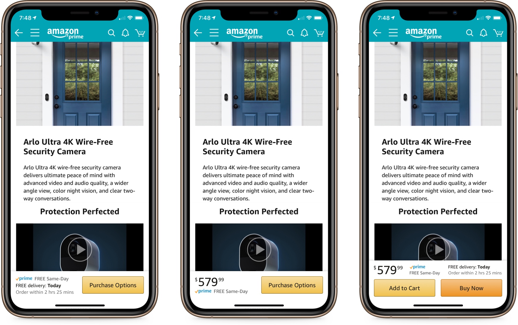
Static mockups of the main concept along with some alternate ideas I explored. I ultimately decided it was too problematic to incliude multiple CTAs in the sticky footer, due to the additional options you have to consider (product variations, one-time vs. monthly payments, quantity, etc.) before choosing Add to Cart or Buy Now.
Click the image to enlarge.
Desktop
On the Amazon.com desktop experience, I took a similar approach as on the mobile app, but created space in a sidebar to display the sticky module after scrolling past the existing sidebar content at the top of the page. Clicking the single purchase CTA similarly scrolls you back to the top of the page where the existing purchase UI is.
The desktop interaction is similar to mobile, but docked in a sidebar. Also, since we have more room we can disclose all the important pricing and shipping details. Click the play button to watch a video of the prototype.
Research
To support my hypothesis, I leveraged personal experience from a similar project I worked on at LoopNet, and researched case studies of other sites’ experiences testing sticky CTAs. As detailed in the project plan later, I would validate my research by running user tests as well as measuring conversion rates on small audience segments to objectively confirm that this would be a positive change before broadly releasing the feature.
At LoopNet, a commercial real estate marketing platform (similar to Zillow, Trulia, or Redfin), we had a contact sidebar on our desktop listing detail pages that contained the listing broker’s contact information as well as a Contact CTA that submitted a lead to the broker. We converted the sidebar from a static to fixed element and our tracking proved a significant increase in overall leads submitted.
In researching similar approaches, I found reports of tests confirming that a sticky CTA outperformed a static one:
- Growth Rock: Sticky Add to Cart Button Example: Actual AB Test Results
- GoodUI: Pattern #41: Sticky Call To Action (requires account to see results, but site owner confirmed the tests he collected “predict a positive outcome”)
- AB Tasty: Should you Make the Main CTA on Mobile ‘Stick-to-Scroll’? (Fashion retailer Unkut introduced a mobile product page sticky CTA and “clicks increased by 55%, and transactions grew by 7%”
Project Plan
Here’s a conservative outline of the work I'd estimate to complete the project. This is of course dependent on how any given company works — for example, if a company has a highly skilled front end engineering team, they could be brought into the early design phases and start building sooner.
- Designer works with product manager to understand high level business requirements and KPIs
- Designer researches existing UX solutions and case studies to assess risk
- Designer creates initial mockups and prototypes
- Designer works with product managers, design team, and other stakeholders to iterate on design concepts
- Product manager and designer collaborate with development teams (mobile and web, if separate teams) to vet any high level technical concerns
- Designer tests prototypes with internal stakeholders and external users
- Designer synthesizes feedback from testing and iterates as needed
- Designer finalizes v1 and works with product manager to get work in dev pipeline
- Designer works with dev teams to implement and test UI build
- Launch!
- Measure conversion rate on tested audience segment and assess next steps
Estimated timeline: 7 weeks (2 3-week sprints + 1 week) — mobile and web teams (if separate) would work in parallel
- 1 sprint to design/iterate/test/spec
- 1 sprint to implement/QA/launch
- 1 week to gather and assess results
Part 2: Creative Direction
Diving into this part of the challenge required a couple quick lessons: 1) grounding myself in the general aesthetics of a fashion brand, and 2) getting up to speed on the technical requirements of Instagram carousel ads. This is the kind of stuff I love, rapidly learning (or mentoring someone else) how to solve problems to get a project done.
First, I studied Farfetch's website, app, and Instagram profile to get an idea of their general UI sensibility. I also read the article Great Work: Farfetch, The World Through Fashion, which was helpful in detailing a successful ad campaign Farfetch launched.
Next, I read up on the requirements for Instagram carousel ads to understand what use cases I’d need to design for. The Facebook documentation was great, and I also looked at several examples of existing carousel ads in the Instagram app to get a sense for what the general direction was.
For the ad design, I adhered to the existing brand aesthetic Farfetch has established — clean and simple typography, often set on close-cropped or isolated product/model photographs. On the intro carousel slide, I created an animated circular motif that incorporates the “Sell. Shop. Repeat.” copy provided. The slide is supported by copy in the description area using a direct, dry tone (which I assessed as the brand’s voice, as seen in their Instagram posts) introducing the new program in detail.
Each of the 3 successive slides continues to play off of the Sell, Shop, and Repeat theme with a crisp product image (sourced from Farfetch's Instagram posts), clear headline (using more of the provided copy), and text I wrote in the description secion to continue detailing the new program’s offering. I chose to use "Sign Up" for the CTA language, as it’s one of the preset options offered by Instagram that closely matches the provided copy. I used a shade of red featured prominently on Farfetch’s website for the CTA background — I think it stands out well against the product photography and I believe it would convert better than Farfetch's more typical black CTA color.
For the landing page, I adapted the existing Farfetch register / sign in page but added copy at the top to make a better connection with the copy from the ad and provide a consistent experience.
A prototype I created in Principle showing the ad's interaction, including an animated intro slide that incorporates a variant of the "Sell. Shop. Repeat." copy provided. The prototype also shows how the carousel ad takes advantage of using custom descriptive text on each slide to reinforce the theme and support the goal of driving the click-thru rate. Click the play button to watch a video of the prototype.
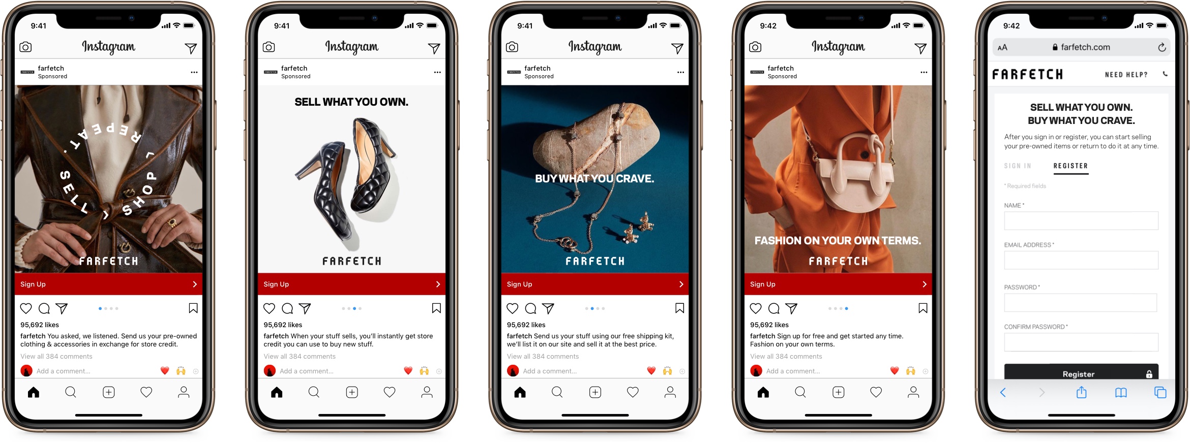
Static mockups of the ad screens and the sign up page. Click the image to enlarge.
Thanks!
Thanks for reading! If you have any questions or feedback, please don't hesitate to reach out.
- Josh
Hi, I’m Josh Fallon — a principal product designer in Los Angeles with several years of in-house experience managing, designing, and launching products on web and native platforms for both large organizations and startups. More about me