Archipelago platform and brand refresh
Years of tech debt and a tight timeline necessitated a smart, phased, and coordinated approach to revamping the platform and marketing interfaces.
Highlights
Key takeaways
- The app UI was outdated and out of sync with marketing materials
- I led planning of a pragmatic solution and got buy in from senior leadership
- I contributed to the launch of an unexpected marketing website refresh
- Platform updates rolled out in 3 sprints; marketing site launched in 1 month
Intro
Spreadsheets = no bueno
Archipelago is a platform for property owners, insurers, brokers, and service providers to achieve optimal insurance outcomes based on centralized, accurate information. Put simply, insuring trillions of dollars of property should not rely on spreadsheets. I was Head of Design for this project.
Objective
I signed up for that, but I'm getting this?
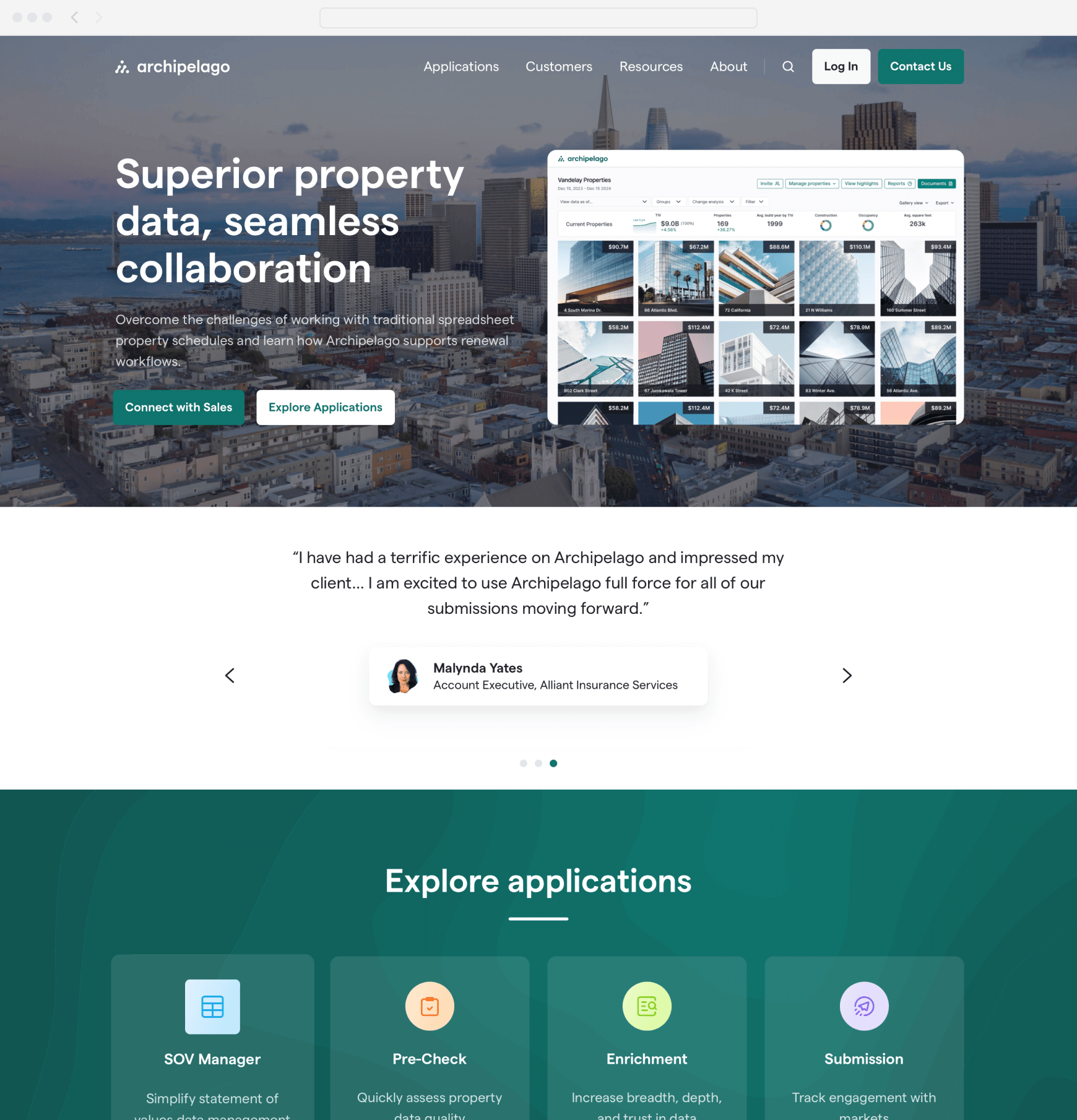
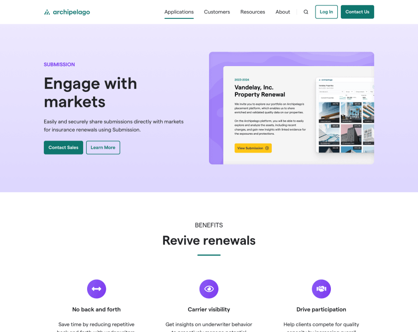
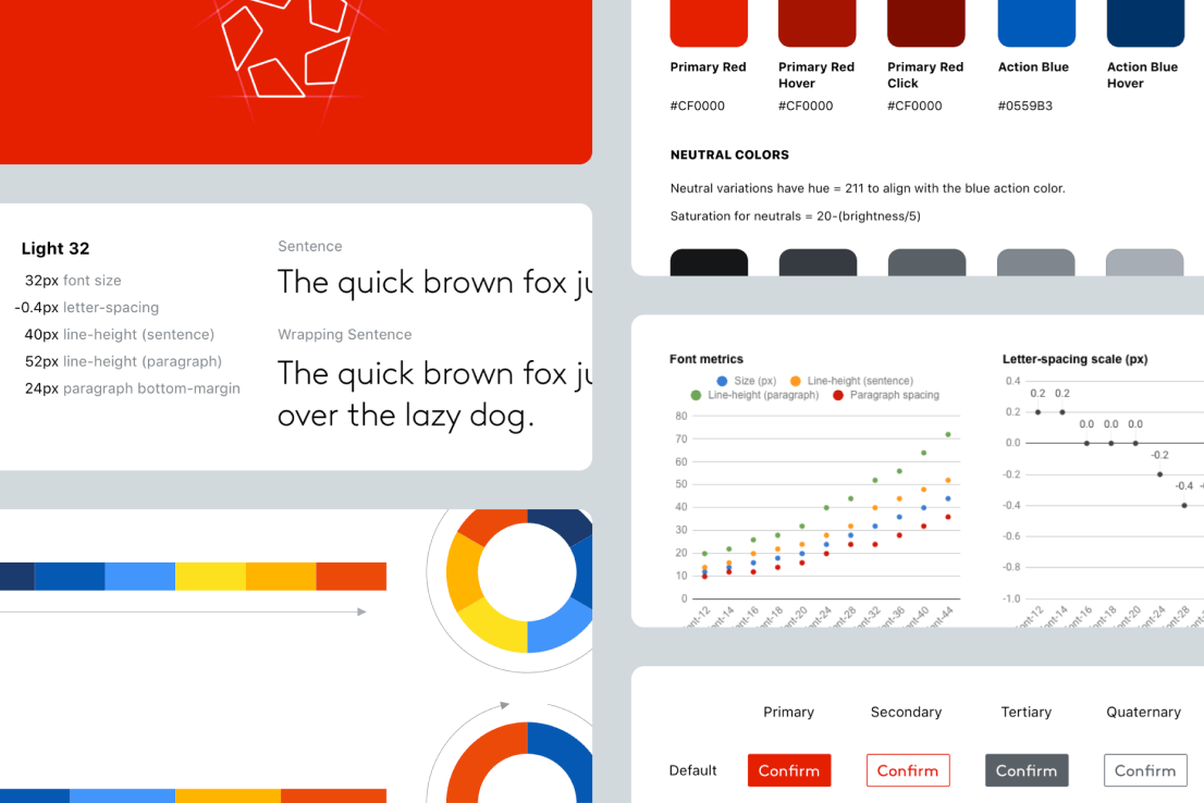
A glaring issue when I joined Archipelago was that the app didn't look at all like how it was presented in our marketing. The marketing website showcased beautiful screenshots of the app, with UI elements themed to match our green branding color, the typography set with the lovely grotesk typeface Matter, and the full logo proudly anchored in the navigation.
In reality, the platform was using the out-of-the-box styling of a 3rd party UI framework — stock blue branding elements, Inter for the font (a beautiful typeface, to be fair), and the bug-only version of the logo quietly downplayed in the navigation. In addition, we were stuck on a version of the framework that was several releases old.
This created a significant lack of cohesion in our brand, and set us up for a breach of trust if customers felt misled. The obvious goal was to update the app UI ASAP — but the trick would be how we could pull it off considering technical hurdles and prioritization within a full roadmap.
Process
Getting to "yes"
I learned from my team how previous attempts at updating the UI never got off the ground. My read was that the approach was too exhaustive (e.g. a 40+ page audit of all the UI that needed to be updated), resulting in a predictably high LOE from engineering that rendered the project a nonstarter. So I knew I’d have to adopt a much more pragmatic approach.
I led my team of 4 product designers in a scoping exercise in Figjam to figure out the table stakes for what we would consider a successful outcome. We coalesced around global, attainable updates (logo, color system, typography, etc.) and bucketed updates into a proposal of 3 modular phases, with an eye towards sideloading each phase parallel to our 2 week feature development sprints. Everything else could be ticketed and prioritized later via the backlog.
Me and one of the senior designers on my team pitched our lead front engineer on the plan, and he was supportive. Next, I got buy-in from product and engineering leadership, specifically acknowledging that the work wouldn’t affect delivery of the already planned sprint work. After getting the green light, the senior designer created the necessary mockups and stories, and we worked with engineering to slot them into upcoming sprints.
Along the way we had multiple design reviews with the product and engineering teams to make sure we were all still aligned on the direction. We also communicated the upcoming changes out over Slack to make sure the broader org was aware and had plenty of time to ask questions and provide feedback.
I also worked with our lead front end engineer to introduce a more efficient way of doing design QA. Previously, designers would test the feature they worked on towards the end of a sprint, create a list of things that needed to be updated, and work with the PM to prioritize what would be addressed vs deferred. This typically resulted in a rush to cram in a small subset of bug fixes and retest them in the waning days of the sprint, creating unnecessary animosity between designers and engineers.
What we started doing instead is having engineers reach out to designers to do UI testing as soon as a pull request was opened. Designers could review the PR in an automated test environment without having to wait for a build to the staging environment. Feedback for UI fixes would be added to the PR, and any larger issues would be elevated to a new ticket. This allowed us to better address fit and finish bugs as they cropped up instead of having them snowball to the end of a sprint.
Results
Trust restored
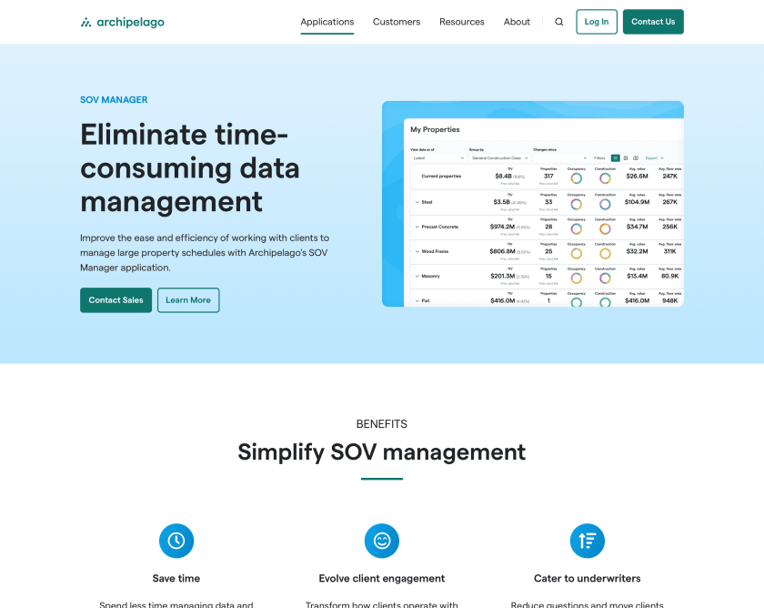
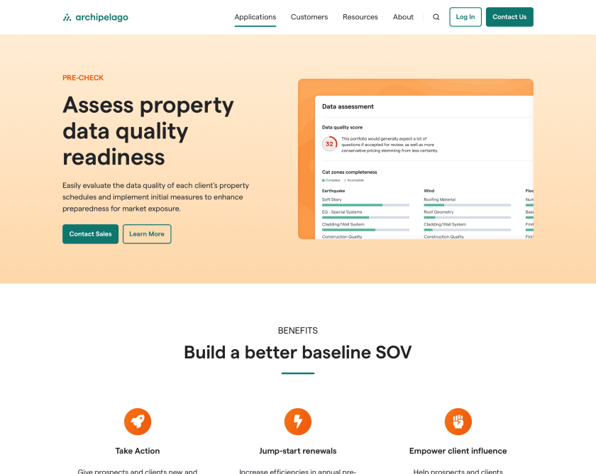
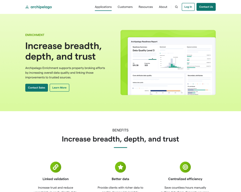
The UI updates successfully rolled out in 3 consecutive 2-week sprints, leading off with the logo, color, and font updates. Despite an initial delay of 1 sprint before any UI updates could be done in order to upgrade to the latest version of the framework and pave the way for future upgrades, the team was thrilled that we could make such a meaningful impact on our brand in a relatively short timeline. And all without impacting the roadmap.
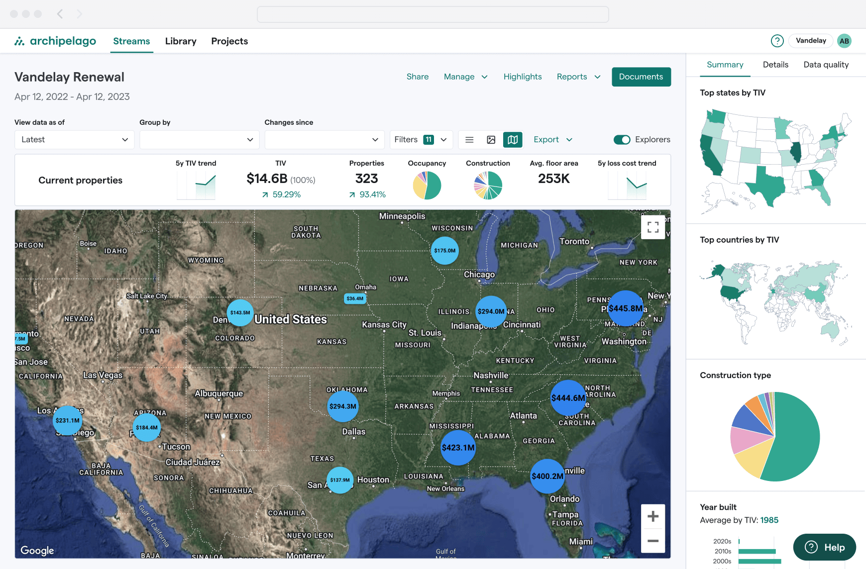
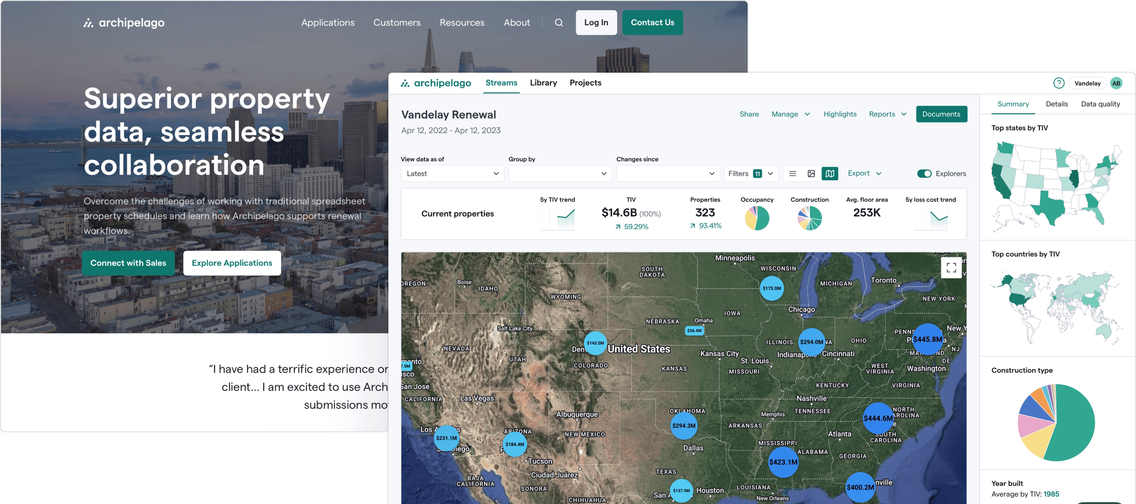
The stream detail page (in map view) after the UI updates.
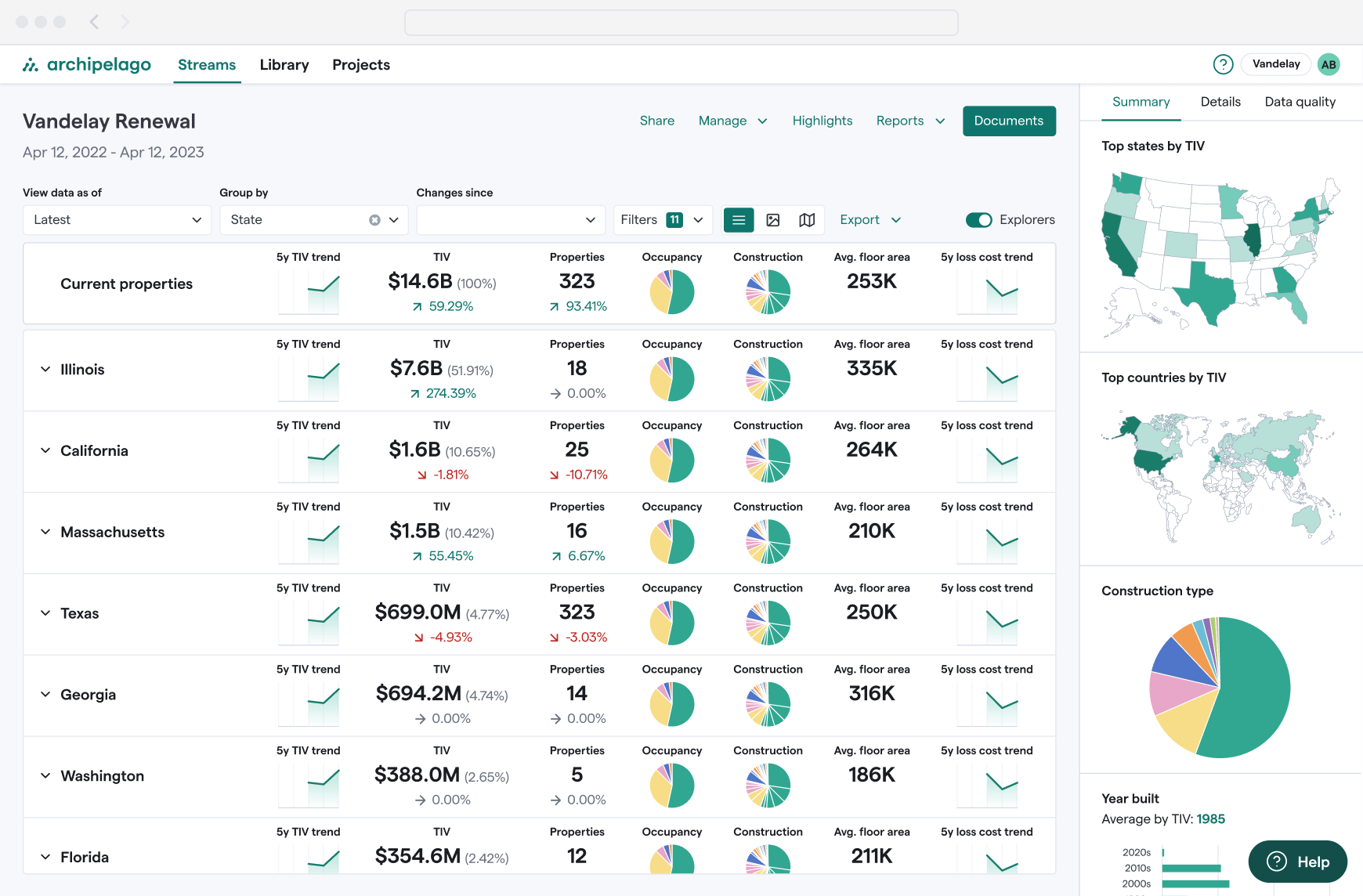
The stream detail page (in grouped grid view) after the UI updates.
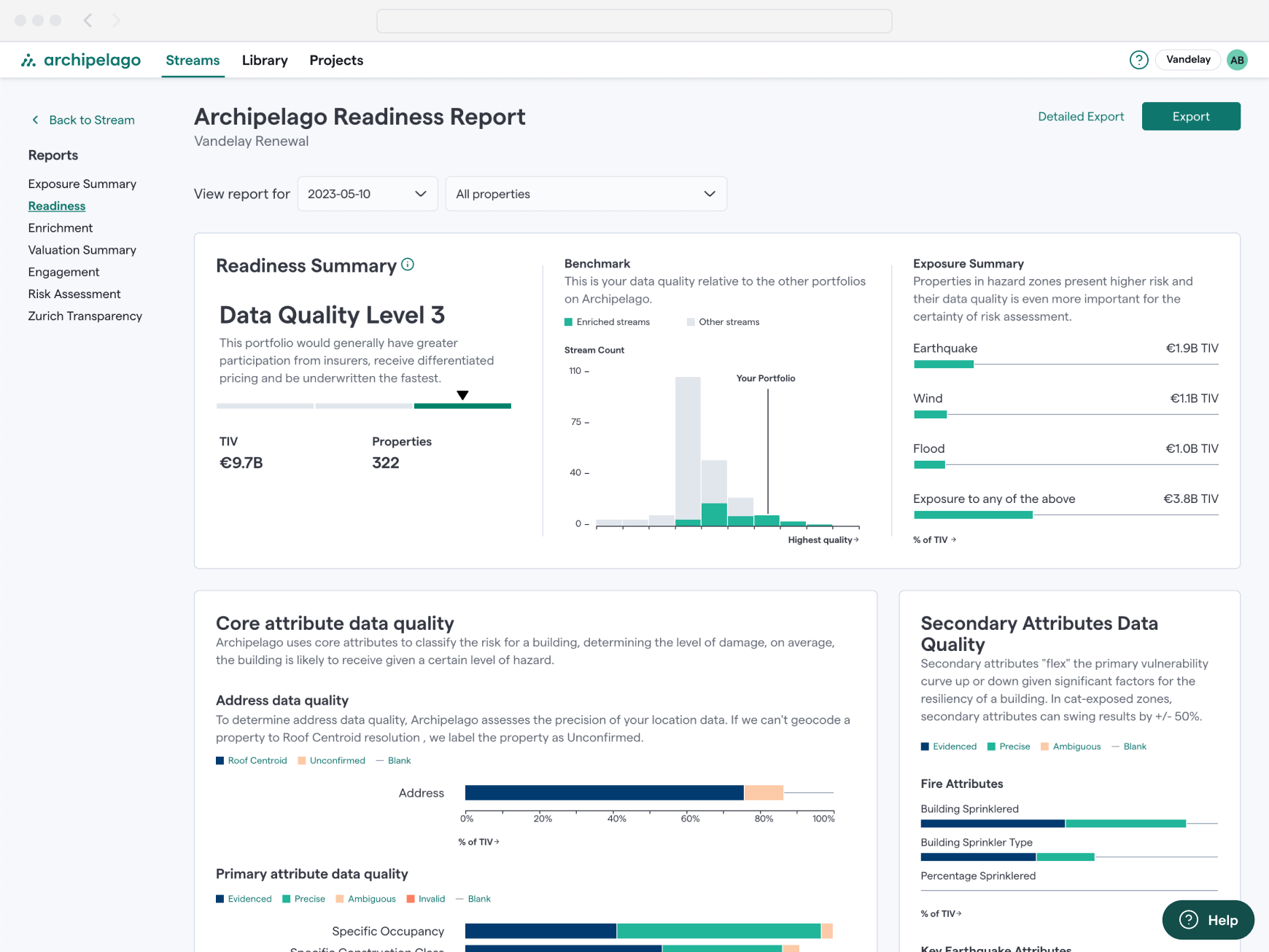
One of several reporting screens that got a fresh coat of paint via the global UI updates.
Postmortem
But wait, there's more
Shortly after the platform UI updates were released, the marketing team announced an initiative to focus our messaging on a different segment of customers. To support that effort, they wanted to completely update the design and content of the marketing website. The kicker was that it had to be done in a month.
The marketing team didn’t have a dedicated design resource, so me and one of the senior designers on my team jumped into the fray. We quickly went to work on nailing down the design of the core page templates and visual elements. We collaborated on mockups for the home page and interior pages, leveraging a HubSpot theme that we adapted with our branding.
After getting approval from marketing on the design, we went to work creating assets and building out the pages in HubSpot while the content was being developed. It came down to the wire as we iterated on the content and did a final round of QA, but we hit our target and launched the updated marketing site within the month.
The new marketing homepage.
Product pages, with a custom color theme for each product.
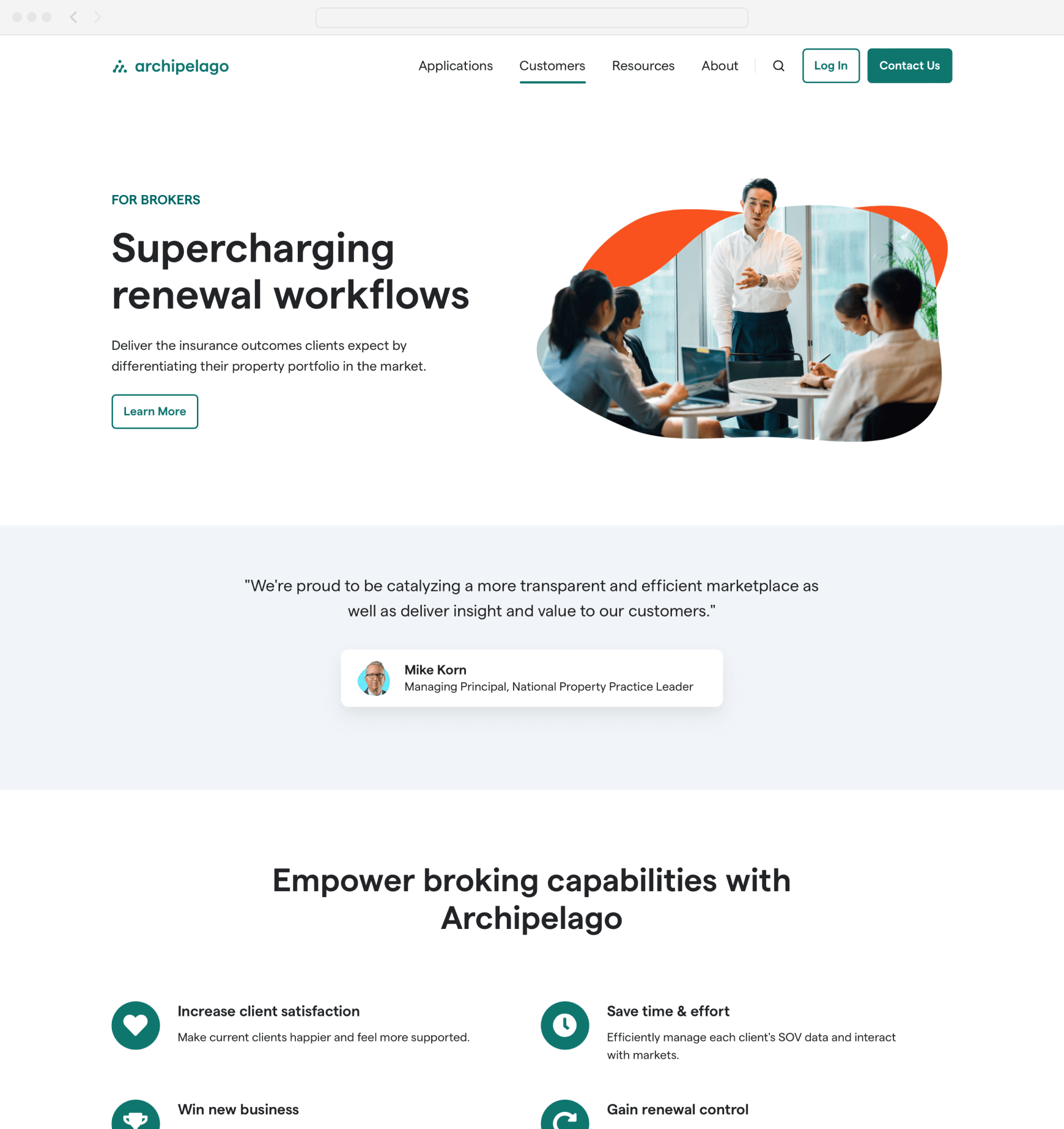
One of the pages built to refocus marketing efforts on a specific customer segment — brokers.
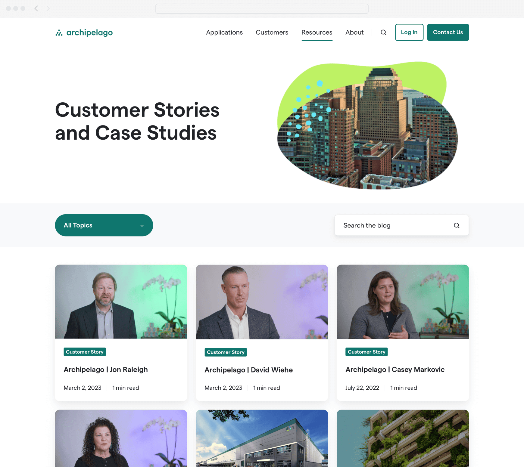
Revamped customer stories and case studies page.
More Featured Work
Hi, I’m Josh Fallon — a principal product designer in Los Angeles with several years of in-house experience managing, designing, and launching products on web and native platforms for both large organizations and startups. More about me