LoopNet listing marketplace
Complex content display use cases were solved through prototyping and leveraging multiple resources.
Highlights
Key takeaways
- The platform needed to support 5 new visually distinct tiers of property listings
- I created several prototypes to validate the UI and guide dev teams
- I built a workflow to allow content teams to create listing content and assets
- LoopNet ad sales grew 37% YoY
Intro
Get in the loop
LoopNet (a division of CoStar Group) is the leading commercial real estate marketplace, connecting tenants and investors to available property for sale and lease. Like Zillow, but for offices, warehouses, restaurants, and the like. I was Senior Design Manager for this project.
Objective
Ten pounds of data in a five pound bag
Apartments.com (another CoStar Group vertical) had successfully introduced a multi-tier listing system to their platform, and we were going to implement a similar update on LoopNet to offer customers more options for exposure. However, the LoopNet commercial real estate platform had much more nuanced data to account for compared to residential — over a dozen property types, up to 5 brokers on a listing, listings for both sale and lease, and multiple spaces within a listing, to name a few.
My team's objective was to take all this into account and collaborate with the CoStar product team to make sure the newly designed marketplace would work with all the use cases that the combination of a tiered system and varied content presented.
Process
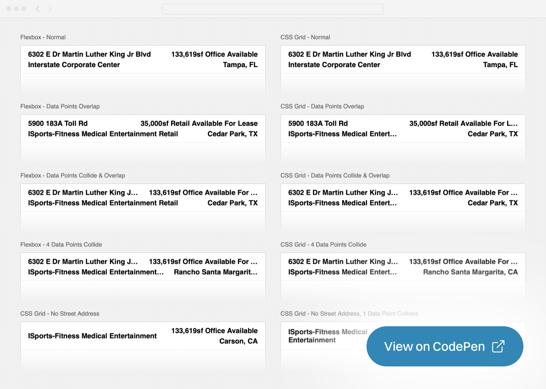
Hyped for prototypes
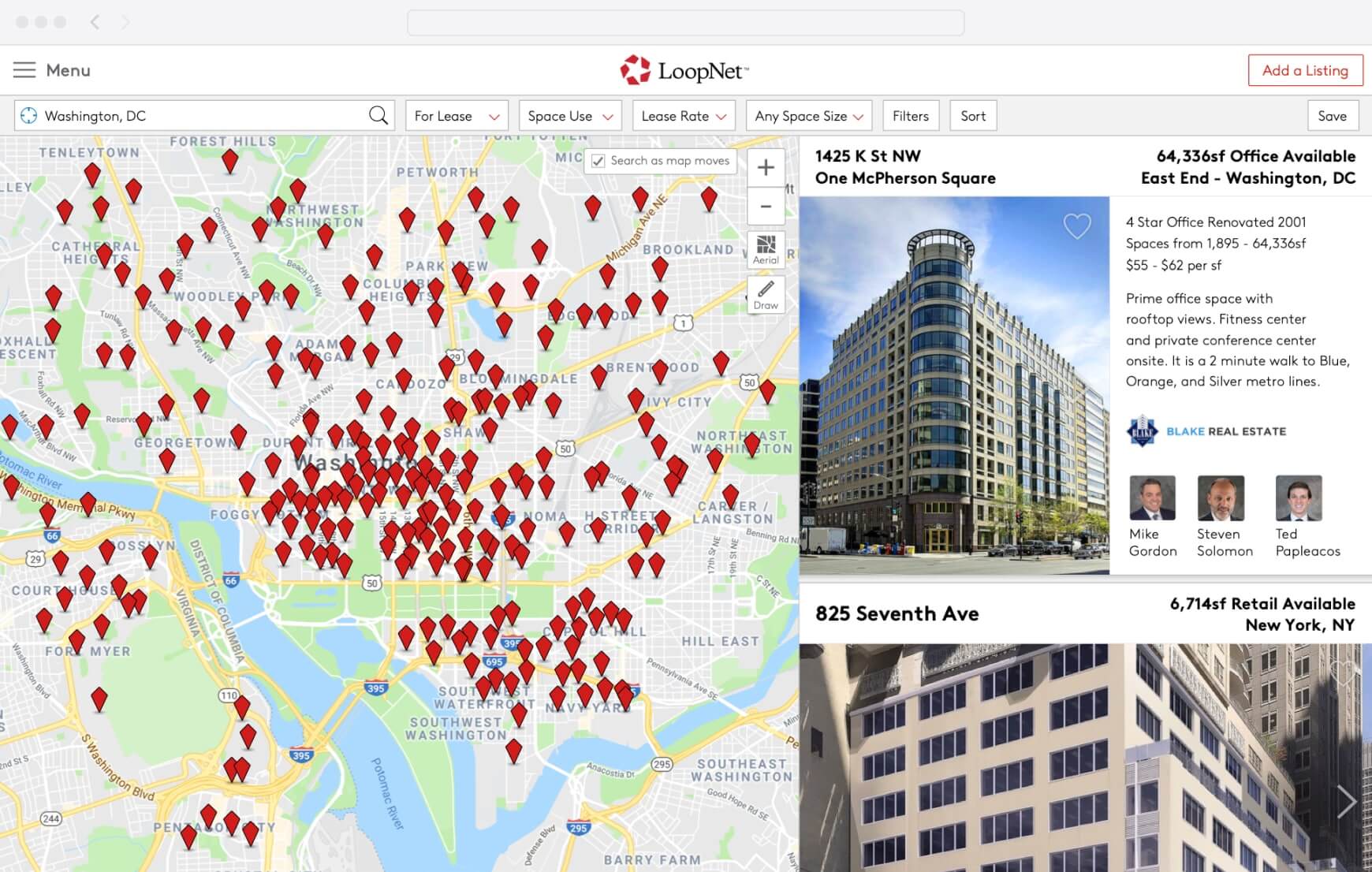
The changes would impact the 2 most visited screens on the platform — search results and the listing detail page, so we had to get it right. The search results consisted of a large map view with a panel of listing results we called placards. The placards had a few elements that I created prototypes for to validate the data layout. The header of the placards displayed 4 data points in 2 rows and 2 columns, each of which had the potential to run long and need to be clamped. I created a prototype in CodePen presenting several options.
Card headers had 4 data points, each which had the possibility of displaying long strings of text. To help decide how to best handle the different cases of data colliding, I created an HTML prototype illustrating different combinations of using flexbox, CSS grid, and text-overflow. View on Codepen
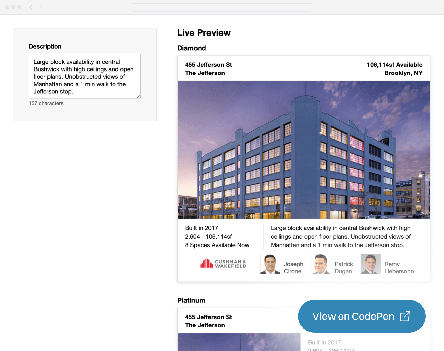
The top 2 tiers of listings (Diamond and Platinum, natch) displayed a description of the property, curated by the CoStar research team. However, there was limited space on the placard for the description as they weren’t responsive vertically. I created a prototype of a tool that would allow researchers to see a live preview of the placards as they wrote the description, allowing them to see when they were approaching being clamped.
I created an HTML prototype to show how we could build an internal tool for our researchers to get a live preview of the descriptions on multiple cards as they wrote them. View on Codepen
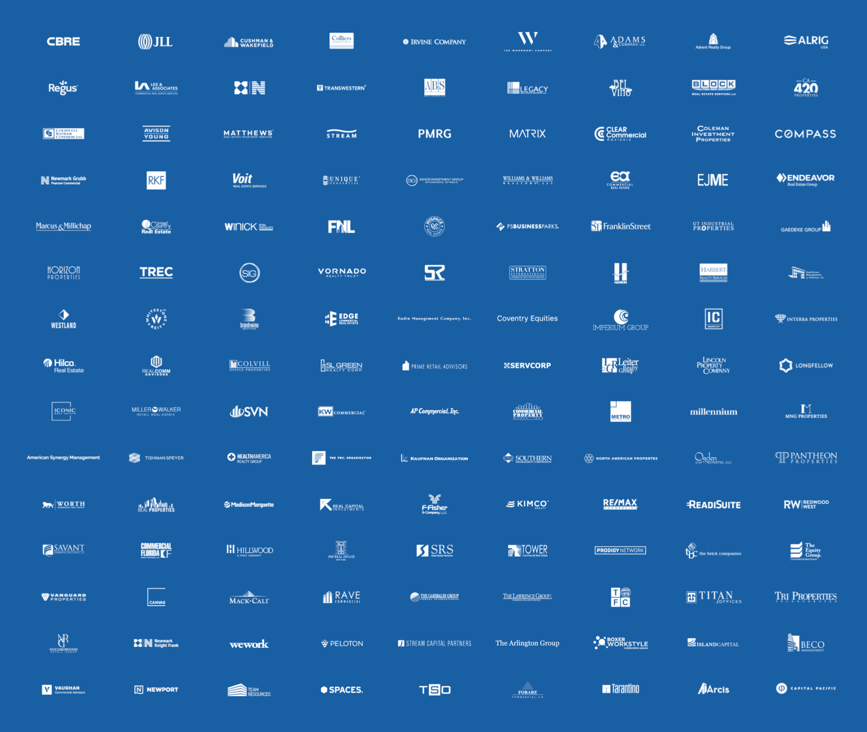
Another requirement for the top 2 tiers of placards in search results was to display the broker's company logo on it. For launch, there would be over 200 distinct logos we needed to support, and we ideally wanted the logo to be in a vector format so we could display it at any scale and on any background. We also didn’t want to place this burden on the customer, so I led my team in an effort to acquire all 200+ logos. We developed a standardized order of operations for sourcing the logos, and when we were done, I documented the process and trained one of our CS teams on how to do it going forward for any new logos needed.
A sample of the over 200 white vector logos my team and I sourced and/or recreated in Illustrator to seed the system when we first launched.
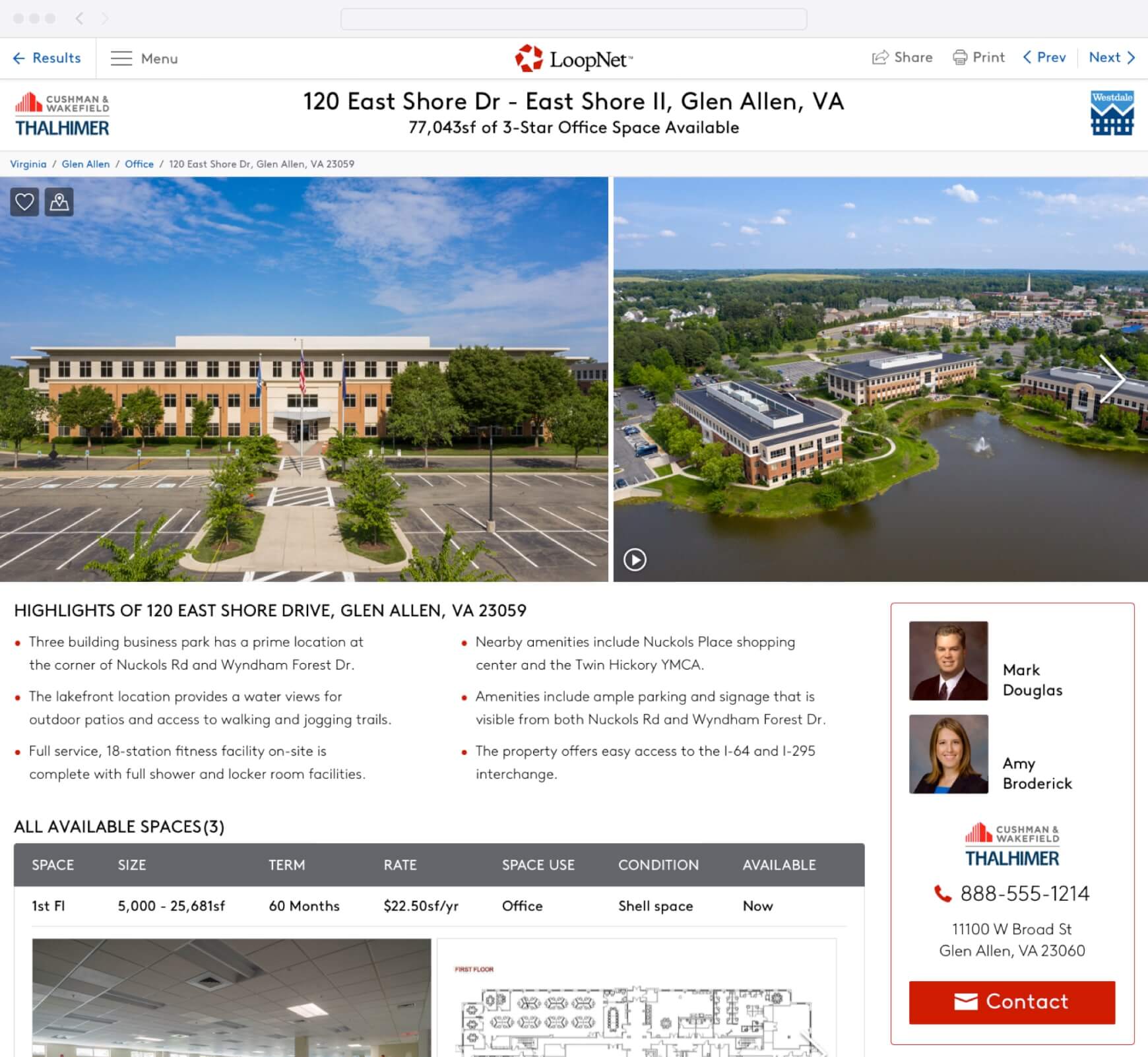
Meanwhile, the listing detail page required an even more radical overhaul that would require heavy content validation. We worked with CoStar’s research team to use real data and photography on 100+ property mockups across every property type for sale and lease to verify that the layout worked. In a couple cases, we even had a photographer sent to reshoot a property because the photos were outdated and not up to our newer standards.
On a microinteraction level, there were a few prototypes I produced to validate implementation. First, there was a section on the page to display spaces on properties for lease. I created an animated prototype in Principle to illustrate how we could have the summary details of each space be sticky in the viewport as you scrolled through the photos and description of the space.
Prototype created in Principle showing how sticky headers and summary rows would behave when scrolling through available spaces.
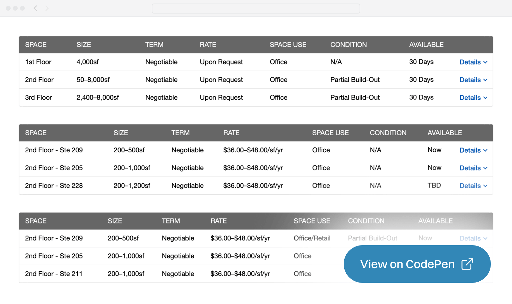
Next, I built an HTML prototype to show how a more compact version of a spaces available table could be displayed and prevent lines from wrapping by making sure the column widths were as optimized as possible (vs making them all fixed widths).
The expanded row interactions of the component didn't allow us to use a standard fluid table, so I built an HTML prototype to show how data summary columns could be evenly distributed like a standard HTML table instead of having fixed widths. The rendering logic was inspired by the Mozilla browser source code for calculating table row widths. View on Codepen
Finally, I created several animated Principle prototypes pitching various ways to gracefully display a sticky contact broker module that could accommodate up to 5 brokers and a contact form.
My favorite concept had the brokers section at the top get clipped as it scrolled past the top of the container, and then just displayed the brokerage contact information and the call to action. It looked cohesive and elegant, but ultimately was too complex to build quickly so we settled on a functionally similar but less fluid solution.
Results
The light at the end of the tunnel
This was probably the longest successful project I’ve ever worked on. We did so much data validation upfront during the design process that we were very well equipped to work with engineering to build it out. That being said, it took months to build and test everything before we were ready to launch. Following the success of the Apartments.com platform, the new LoopNet marketplace exceeded expectations. In CoStar Group's 2019 annual earnings report, they announced that LoopNet ad sales grew 37% year-over-year.
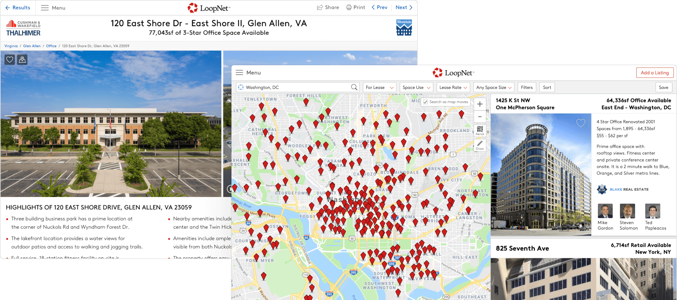
Among other wholesale updates, the redesign featured larger results cards and specialized data for each property type, along with a refreshed UI for the filter bar.
A sample listing detail page, redesigned with more consumer-focused content.
Postmortem
Can we start building now? How about now?
If I had to do a project of this magnitude again, I would (and did) strongly advocate for bringing in engineering resources into the design/prototyping process to pair with designers. Producing 100+ static mockups was exhaustive but not efficient, and I think we could have moved much faster and still achieved our goal by building semi-functional prototypes and pumping in real data to validate content and layout.
More Featured Work
Hi, I’m Josh Fallon — a principal product designer in Los Angeles with several years of in-house experience managing, designing, and launching products on web and native platforms for both large organizations and startups. More about me
