Surefront design system and documentation
Building a more comprehensive resource required breaking out of Figma and expanding the scope to document how we build products.
Highlights
Key takeaways
- Surefront needed to evolve from a style guide to a consumable design system
- I stood up a system that synced Figma and Storybook components
- I led and authored documentation that outlined our product dev process
- The design system became an integral resource for product and marketing teams
Intro
Break out of your cells
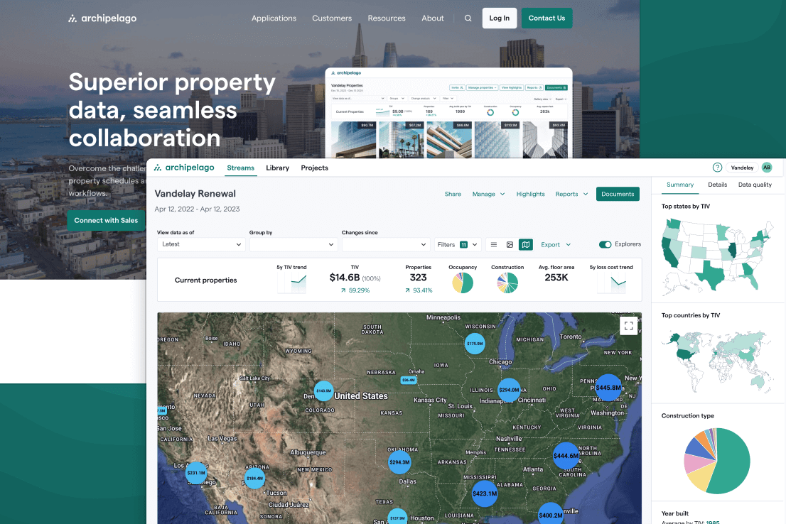
Surefront is a B2B enterprise app that enables retail buyers and suppliers to seamlessly collaborate on projects, quotes, and orders. In what appears to be a recurring theme in my career, our mission was to move customers away from using spreadsheets and email to collaborate on mission-critical business processes. I was Director of UI/UX for this project.
Objective
More to life than Figma
When I joined Surefront, the design system was essentially a set of core styles, components, and patterns isolated in Figma. One of my top priorities was to evolve it to be a more robust and consumable set of documentation that not only cataloged the parts of the system, but provided context for how and when to use them. On top of that, the new design system would be a living resource for the design, development, and marketing teams to reference the Surefront product design process — including our principles, personas, pre-flight checklists, and more.
Process
Zero(height) to hero
I advocated for and implemented Zeroheight to be the single source of truth for documentation. This allowed the team to seamlessly display visual Figma components that my team owned and maintained, Storybook code that the engineers maintained, and critically, guidance for why and when to use the components.
On top of that, I led the effort to create and maintain sections in the design system that documented our design principles, product playbook, customer personas, and design checklist.
Results
Everyone, get in here!
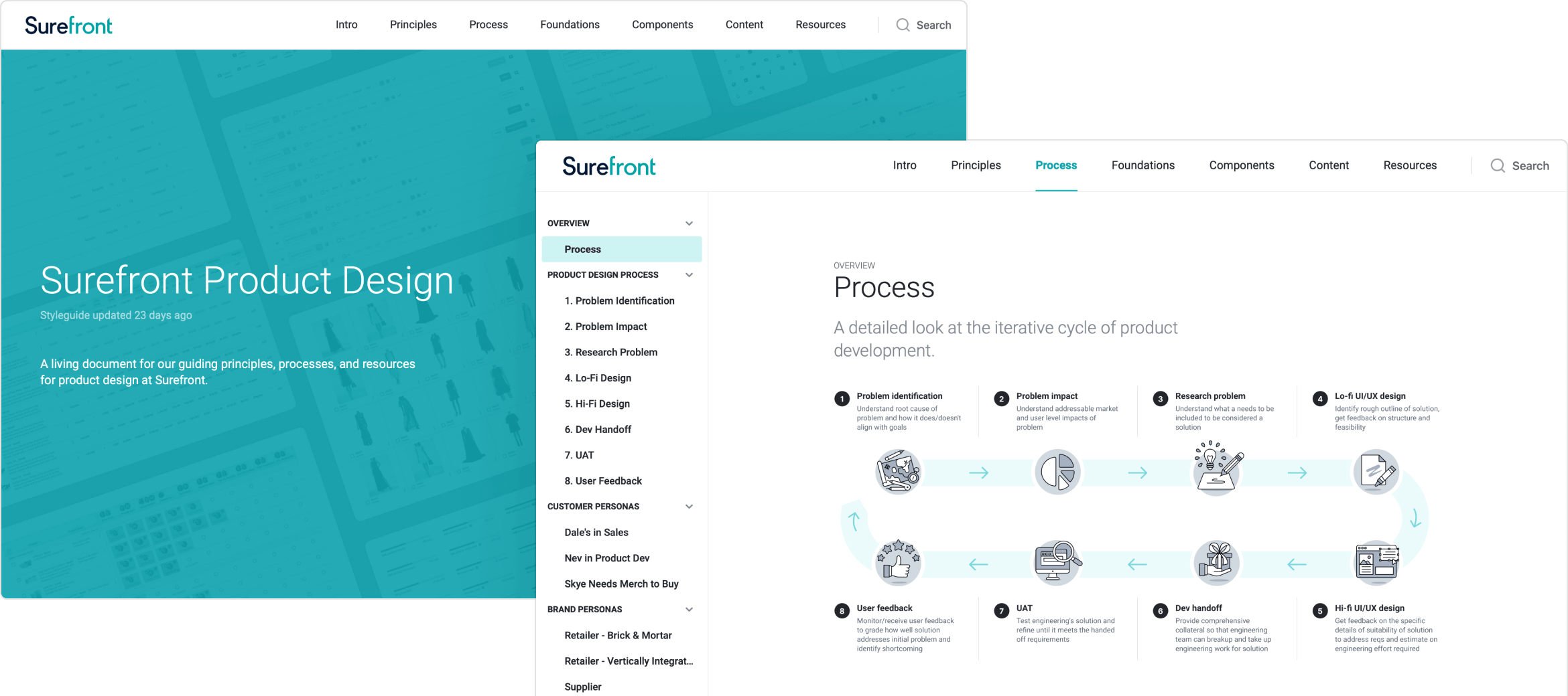
The final result was design.surefront.com (password-protected, only accessible internally) — a frequently updated resource available to the entire organization that was a one-stop shop for everything related to product design and development at Surefront. Not only was it an essential resource for product and engineering, but we eventually got the marketing team using it as well to make commonly requested assets like logos and product screenshots easily accessible.
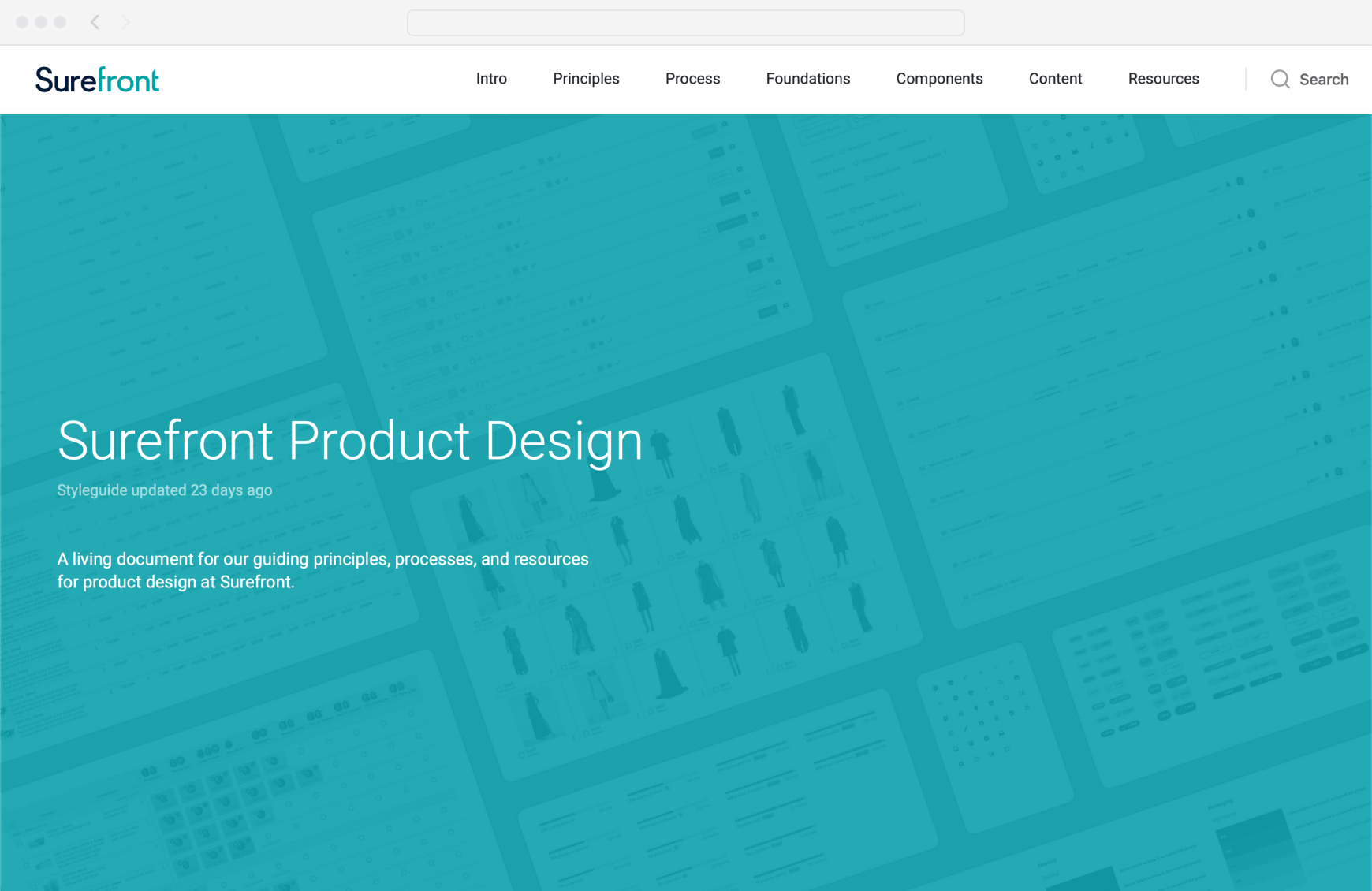
Powered by Zeroheight, this was the landing page at design.surefront.com (password protected) that provided a taste of the components inside and the navigation for browsing the documentation.
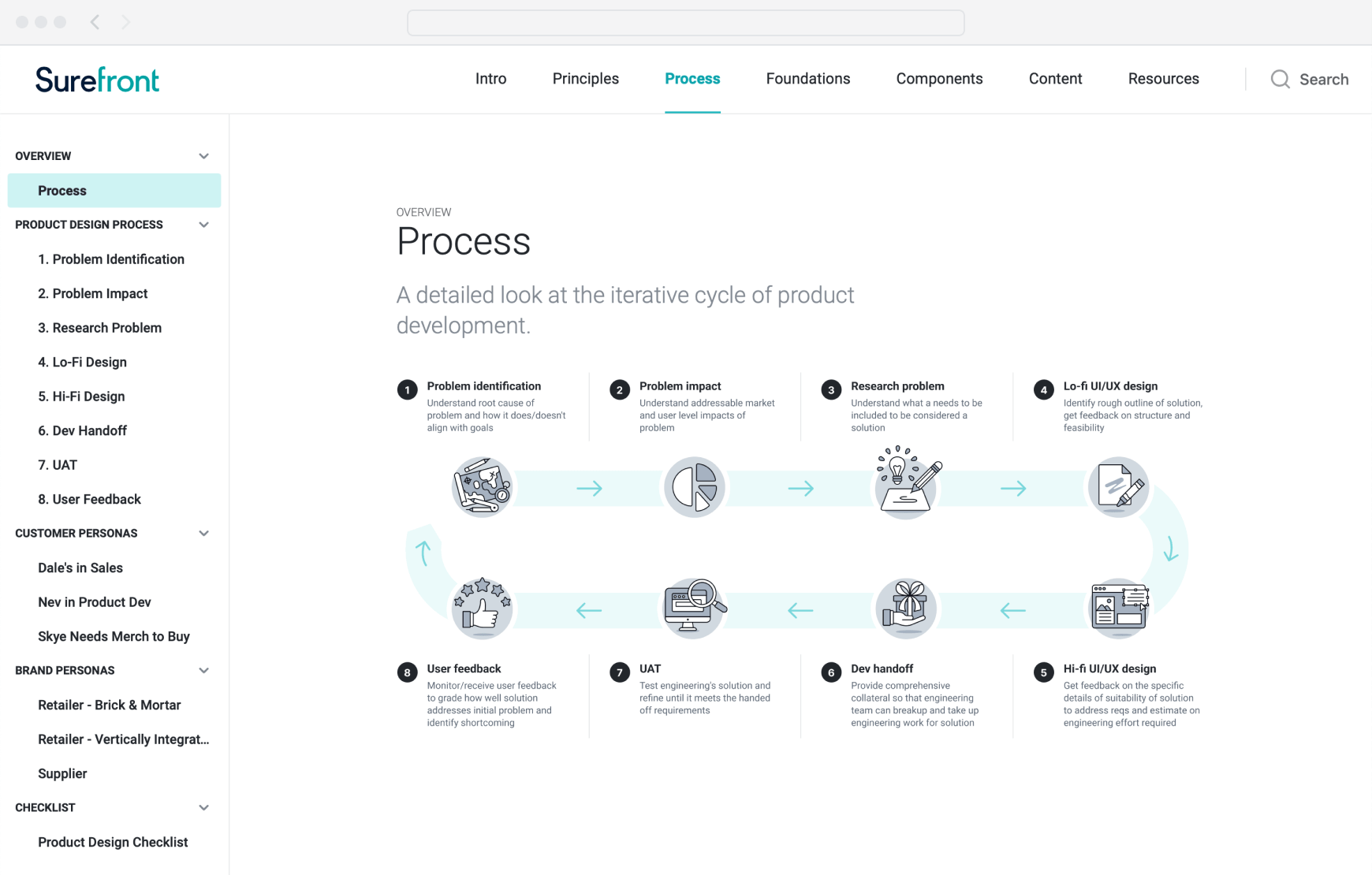
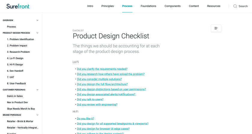
The Process page provided a step-by-step overview of how we build products at Surefront, with detailed writeups for each step available as well. The documentation served as a touchstone for the existing team as well as a great onboarding resource for new team members.
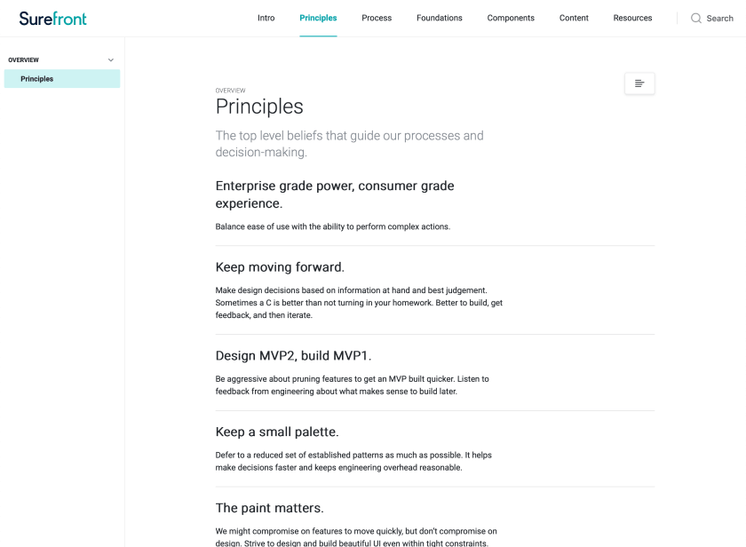
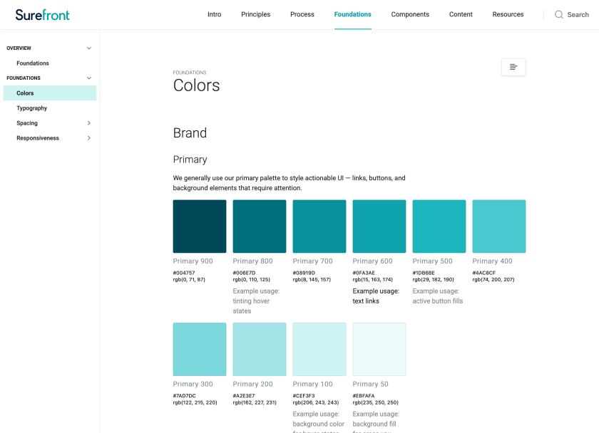

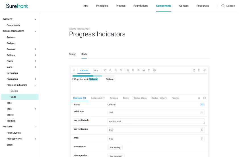
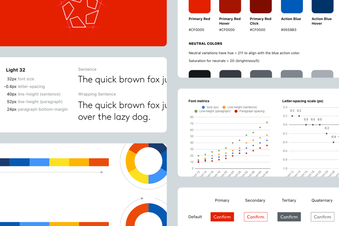
The nuts and bolts of the design system included not only documentation for core styles, components, and patterns (as well as embedded Storybook components where applicable), but other valuable resources such as our design principles, a pre-flight checklist, and customer personas.
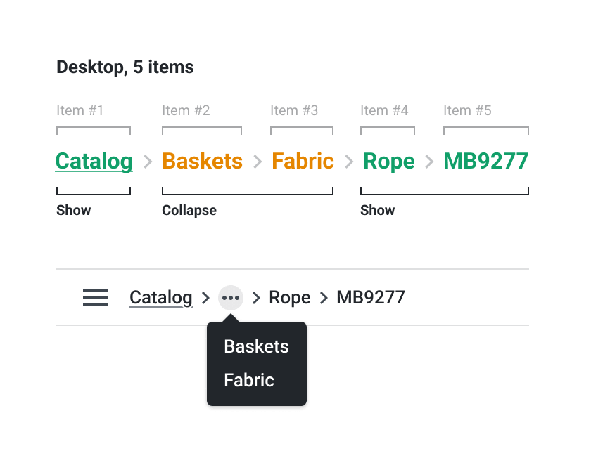
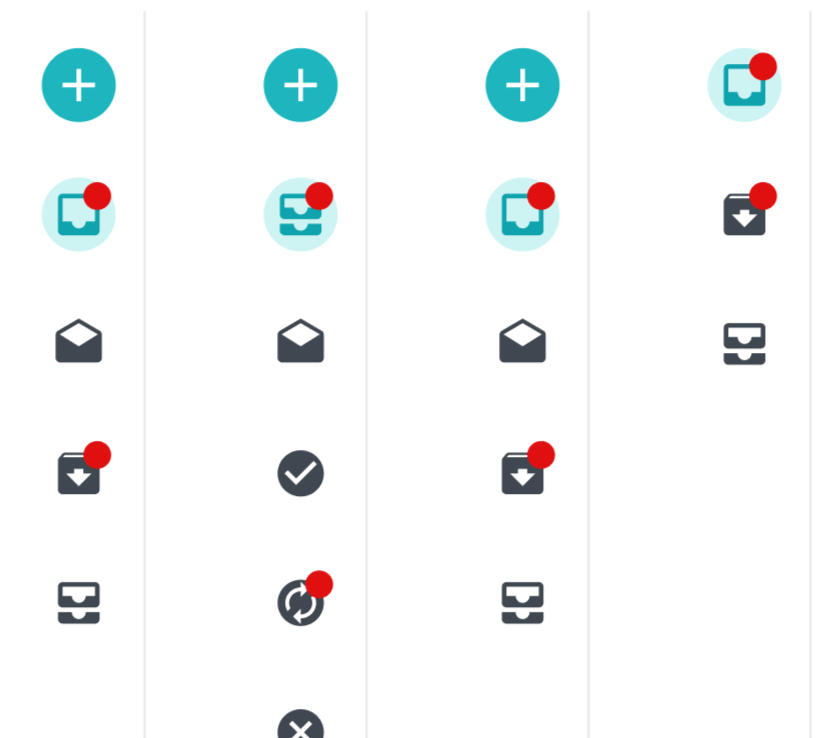
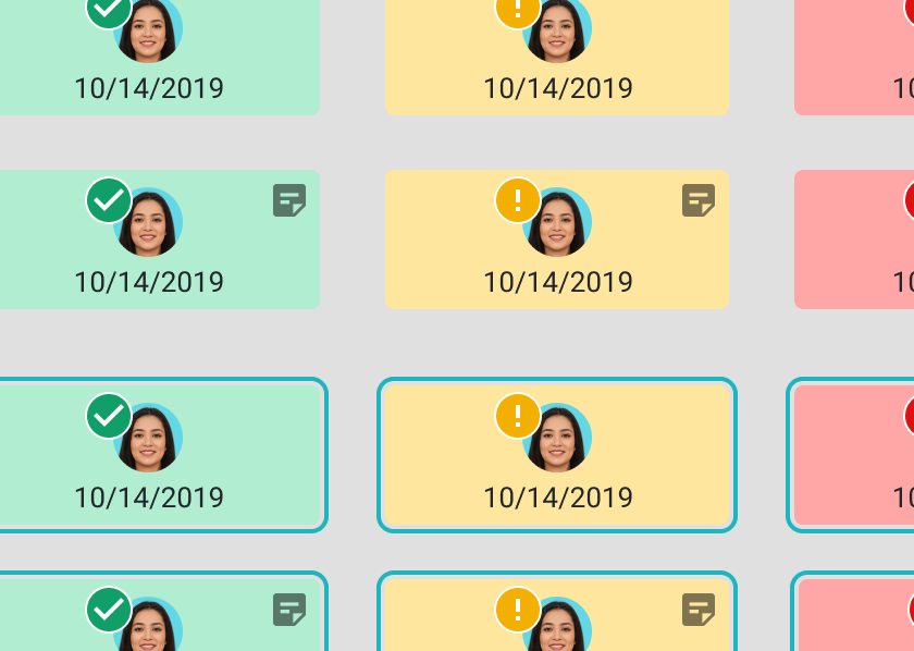
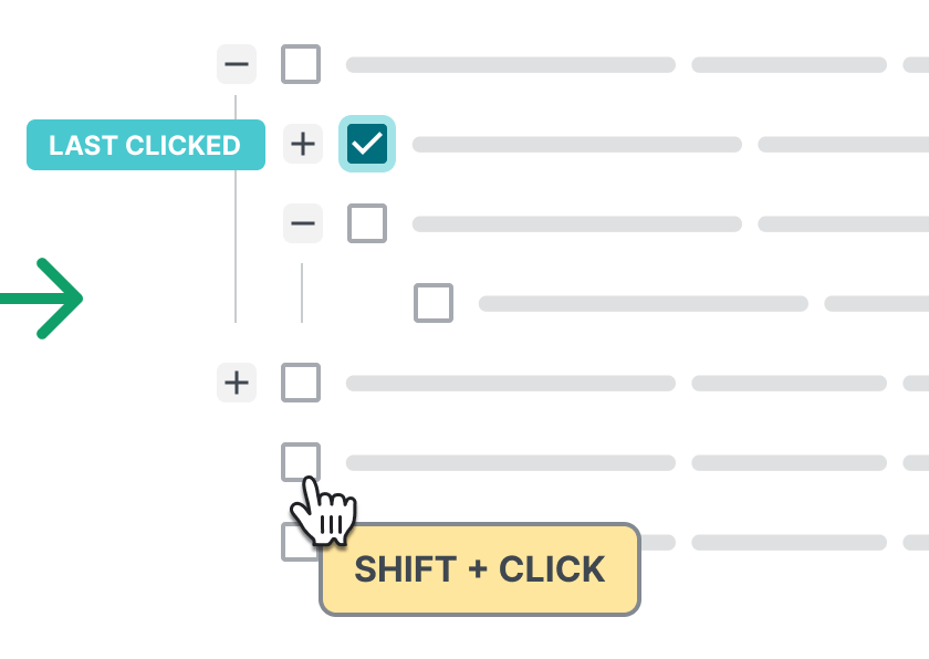
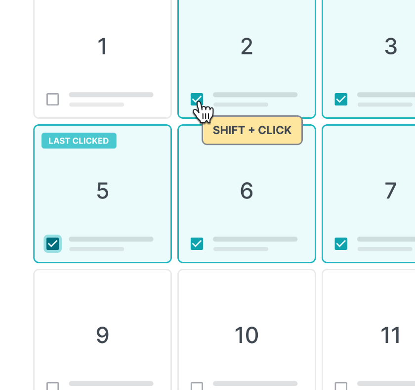
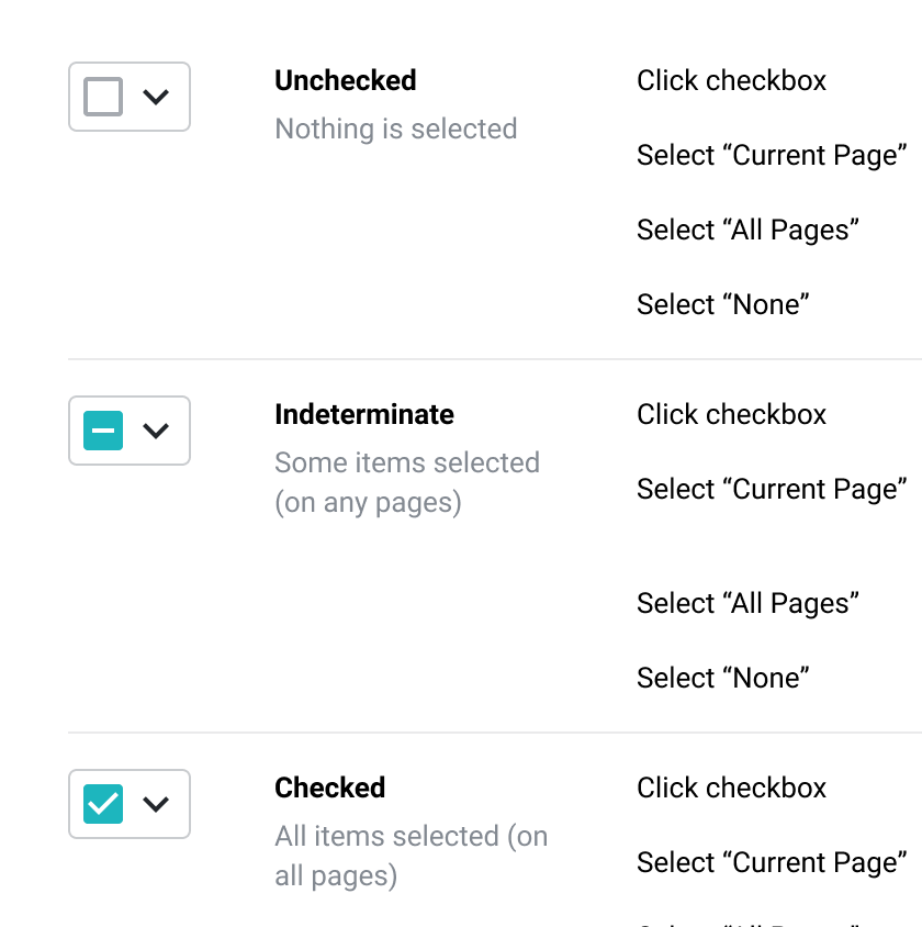
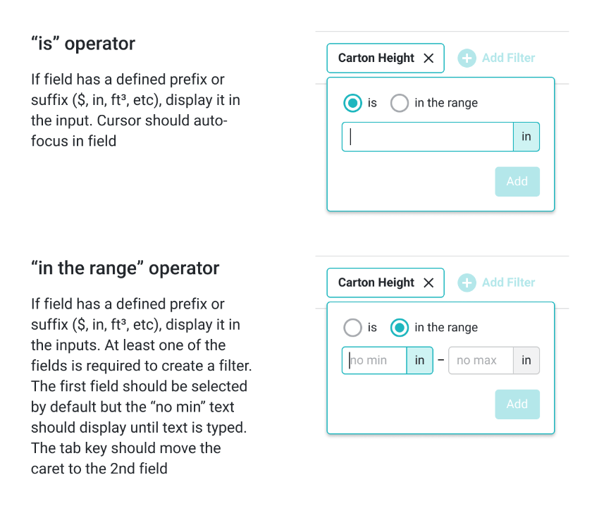
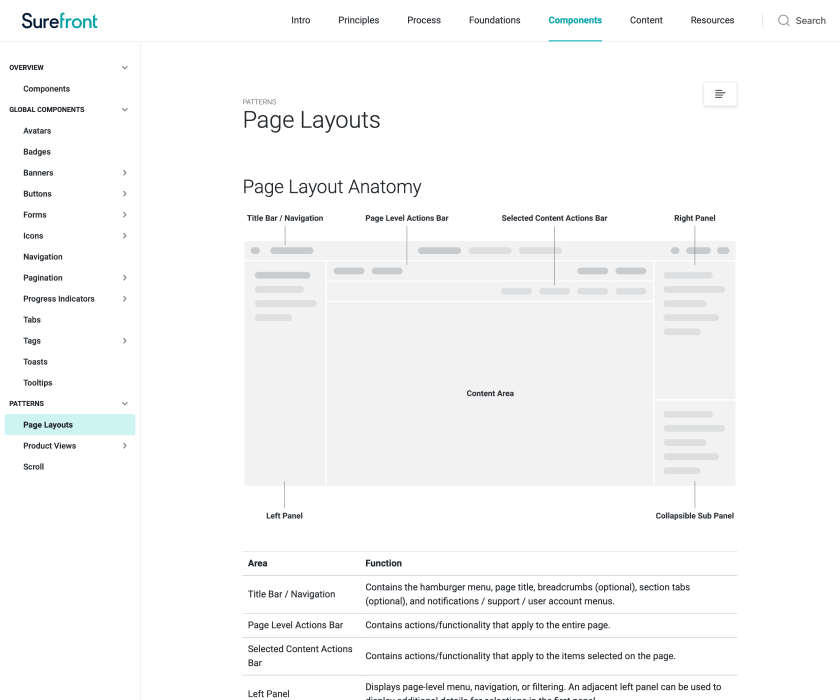
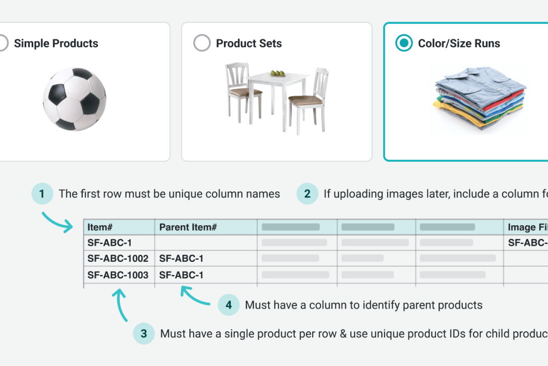
A selection of design patterns that I produced to help support various platform features.
More Featured Work
Hi, I’m Josh Fallon — a principal product designer in Los Angeles with several years of in-house experience managing, designing, and launching products on web and native platforms for both large organizations and startups. More about me